Ongoing Relationship
We currently run and organic SEO campaign for the team as well as monthly design retainer where we help with the creation of resumes, proposal and other marketing collatoral

SiTESPAN LLC is a design-build and operations firm that specialise in mission-critical technical facilities, such as data centres, telecommunications hubs, and other infrastructure.
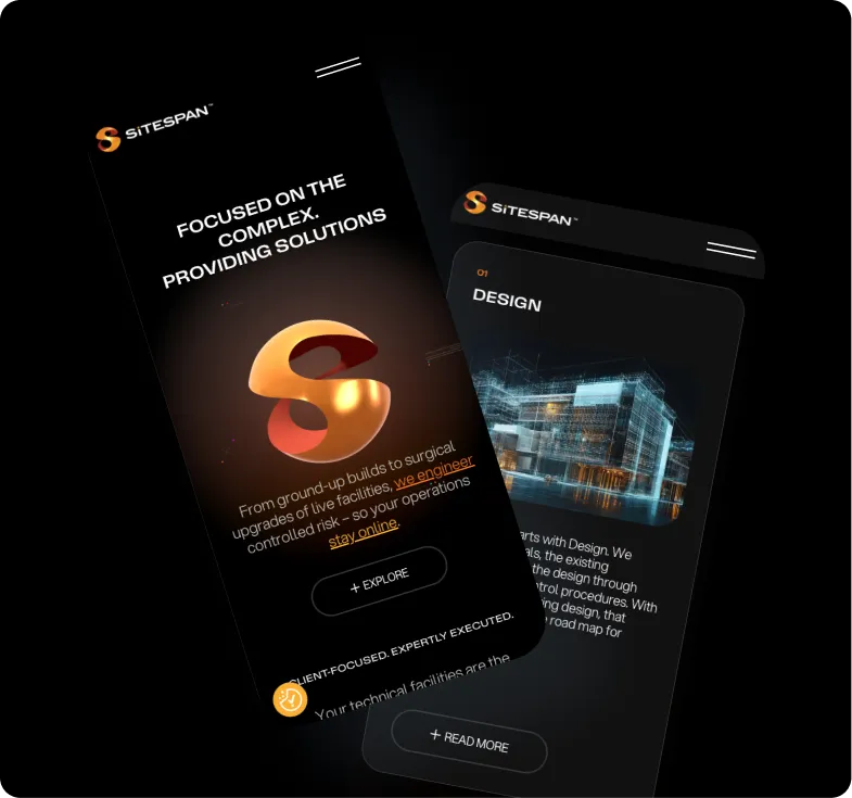
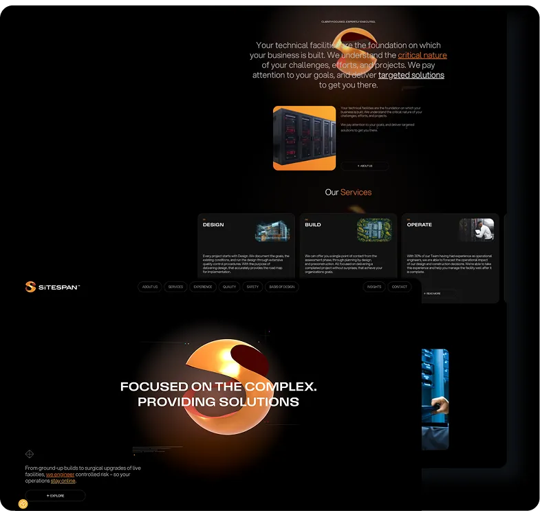
The team at SiTESPAN felt their website was dated and unprofessional and was not representative of their position in the market. The aim was to create an interactive, polished and “mission impossible” style website.

Operations Director
Georgia Brown
Technical Director
Tyler Hounsome
Senior Marketing Manager
Zach Fry
Senior Web Designer
Peter Niesc

Full Stack Developer
Toby Stimpson
Book a call with one of our friendly experts and let’s chat about how we can bring the same results to your project.

SiTESPAN approached us after working with several different web design agencies without success. Although their team is based in the US, they expanded their search globally and ultimately found us. They were looking for a striking website that captured a “mission impossible” feel. The team were looking for something bold, distinctive, and purposefully designed to reflect the high-stakes nature of their work.
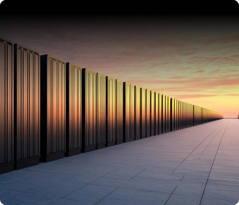
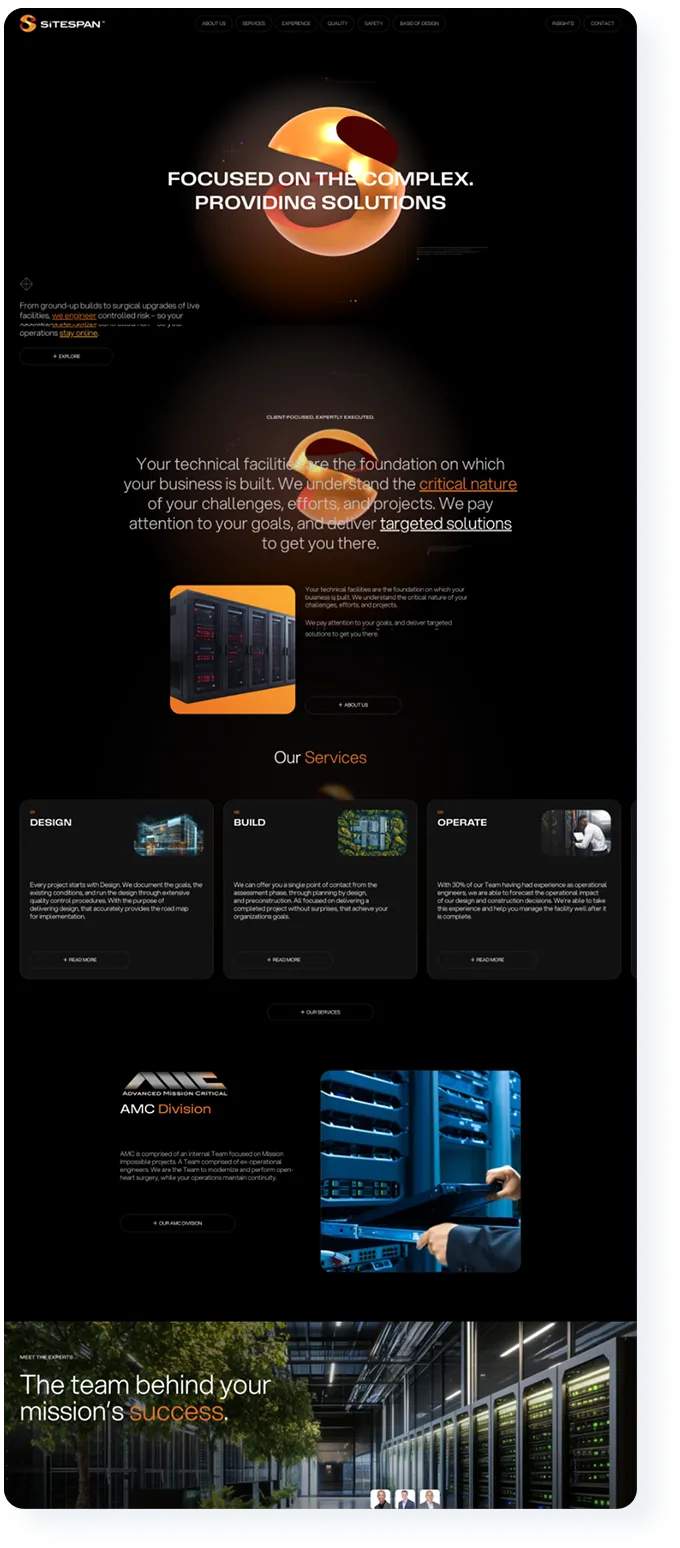
SiTESPAN already had an established brand identity when they came to us, but they wanted to place greater emphasis on the spherical icon in their logo. Early in the project, we converted this element into a 3D object that could be used consistently throughout the design. We also sourced imagery of data centres and facilities that complemented the “mission impossible” aesthetic that we were going for on the new site.
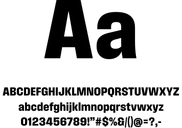
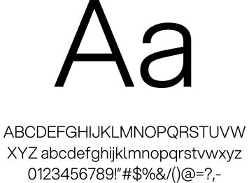
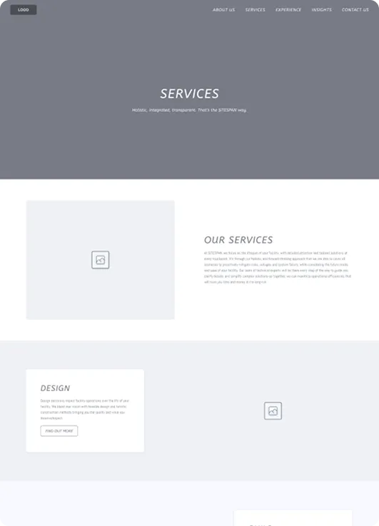
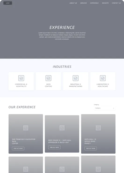
SiTESPAN receives a lot of their work through direct referrals, so the website was not intended as a lead generation tool. Instead, it serves as more of a portfolio to showcase their expertise, professionalism, and position as market leaders. With that in mind, we wireframed out the site using a similar structure to their existing site, making some adjustments to certain sections. This approach allowed us to retain the same pages and content, with an effort to preserve SEO rankings.
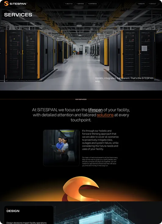
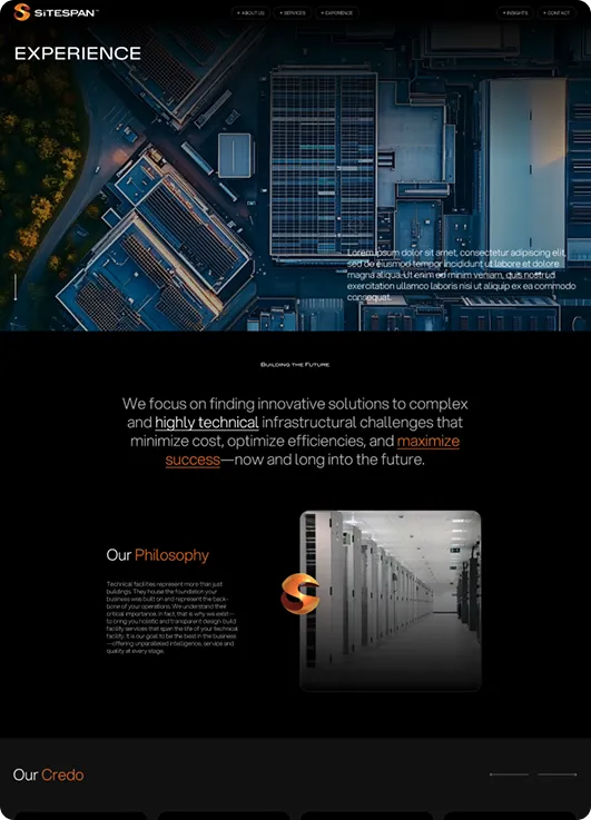
The design brief was clear for the new website, it needed to convey a “Mission Impossible” look and feel. To achieve this, we opted for a fully black background, using their brand orange to highlight key elements. The carefully sourced imagery from Discovery played a central role in reinforcing this bold, high-stakes aesthetic throughout the site.
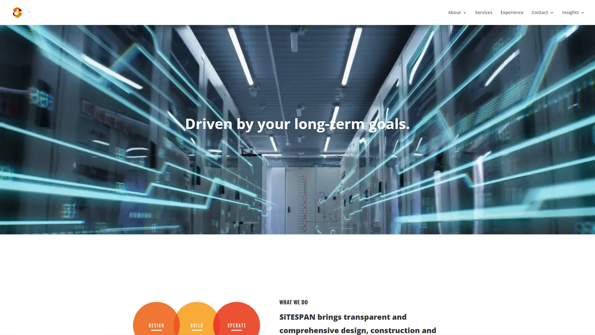
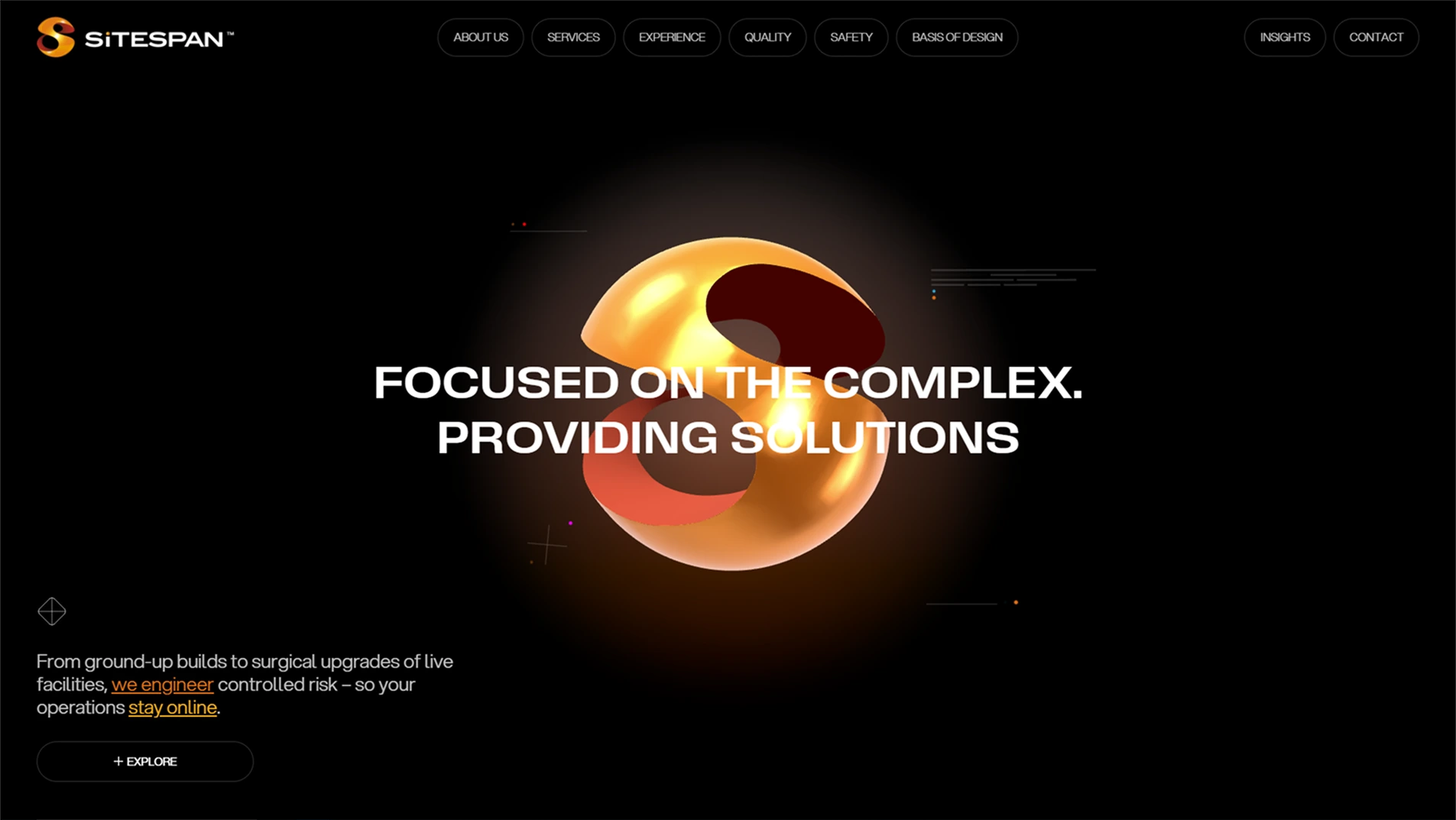
The site was built on WordPress using Gutenberg blocks, allowing the team to easily update content as needed. A key feature in development was the 3D sphere in the hero section, designed to be both bold and interactive, enabling users to engage with it using their mouse.

The 3D sphere in the hero section gives the site a truly distinctive feel. We built the 3D element entirely from scratch, including the load-in animation and hover interactivity. This feature was custom-crafted to align perfectly with the client’s brief and the overall design of the site.

You will regret NOT using CBD for your website design services.
Tim Everson – SiTESPAN